
I am often asked what inspires me and I usually reply, “just about everything”. I recently went to a Japanese woodblock (Ukiyo-E) exhibit [1] which proved especially interesting. Japanese woodblocks are a particularly stimulating source of inspiration for modern film – they were a collaborative process between multiple artists, with a specific stage for color, and they created iconic images that stood the test of time. Looking at these powerful images gave me some fresh ideas for grading, and in this article, I share three concepts that occurred to me, as well as some modern examples that could have drawn on the Ukiyo-E aesthetic.
How did the colors of woodblock come about?
The printing stages of The Great Wave
Hokusai’s “The Great Wave” was printed in eight stages as shown here in the progress board. It included the controlled use of three shades of blue, three layers of gray - including one that is graduated and under the control of the printer rather than the woodblock cutter - and two layers of salmon pink.
Early Japanese prints were often monochromes but as techniques improved, extra colors were added.
The prints in this particular exhibition contained a lot of blue (probably indigo ink), some reds and later some yellows. Few prints contain green, and those that do use a blue green described by the Japanese word “ao”, which means blue or green without distinction and is often translated as “grue”. At the time of the early Ukiyo-E prints there was no natural green pigment to use, so greens were produced by printing yellow over blue. The later prints in the exhibition are noticeably more vibrant in color as industrial colors replaced natural pigments and the color palette expanded accordingly.
What did I notice as I looked at these great prints?
1. Impressions, not accuracy, are powerful
Sanada Yoichi Yoshihisa, Matano Goro Kagehisa, 1835
When I think about the collection, my impression is of black, blue and red. White is also prevalent, but it is where the creamy handmade paper was left unprinted. Woodblocks did include other colors, particularly yellow, but it is absent from my impression of the exhibit and this is an important factor to consider in color grading. To evoke the memory of a product or place, do we use the color we remember or the color that is physically accurate?
Since our visual processing interprets colors according to context, ambiance, and general lighting conditions, we have a choice about the bias we use - and that choice affects the way the viewer sees the image. For example, we might poetically remember the sunny warm yellow sand of an enjoyable beach holiday. An image of a beach on a cool cloudy day with dull gray sand might not conjure up those favorable holiday memories. As artists, we are often more concerned with impressions and emotions than reality.
2. Simplicity, without codification, as an aesthetic pleasure
Another aspect of the prints is that they tend to have a pastel, low-contrast look. I did not notice any strict color coding. Red did not mean power, anger or lust, blue did not mean calm or peaceful (the blue of “The Giant Wave” is anything but peaceful!). Nor did black mean evil and white good, or for that matter death. Instead, I was struck by the careful use of color to achieve balance and focus attention. Color is used as the medium rather than the message. Consequently, the simplified palette simplifies life, and this is reflected in the content of the images. They are often caricatures or abstracts of the complexity of everyday living and I was struck by how aesthetically pleasing such simple images could be. As accustomed as we are to assigning meanings to color, the balance and beauty of the overall picture can be just as important.
Hiroshige circa 1812-1858
3. There are many ways to use color
Nowadays, certainly in Western art, we usually associate low contrast and pastel tones with naivety, innocence or a dreamlike view of things. But the aspects of life depicted in woodblocks aren’t sanitized - there is violence, danger, death and fear in some of the woodblocks and quite adult themes in others. Yet it doesn’t rely on intensity of color for intensity of motion or emotion in the scene. This is a good reminder that there are many ways to use color palettes and we should think outside of our usual conventions to broaden our options.
Similar looks in modern film
What cinematic moments can we think of that could have been inspired by Japanese woodblocks? Whether they were or not is irrelevant, our interest is in creating new looks from old ideas.

Star Wars 1977
The Star Wars universe is one of the most recognizable examples - it is transparent in its use of color to represent opposite sides in the conflict. The lightsabers and helmets of Vader and the stormtroopers clearly have a Japanese influence. The neutral black and white of the Empire costumes contrast dramatically against the warmer earth tones of the rebel outfits.

Astro Boy (2009)
Astro Boy (2009) successfully uses blue and red as synonyms for good and evil and, as it is based on Osamu Tezuka's Japanese manga comics, it has a clear connection to Japanese art history.
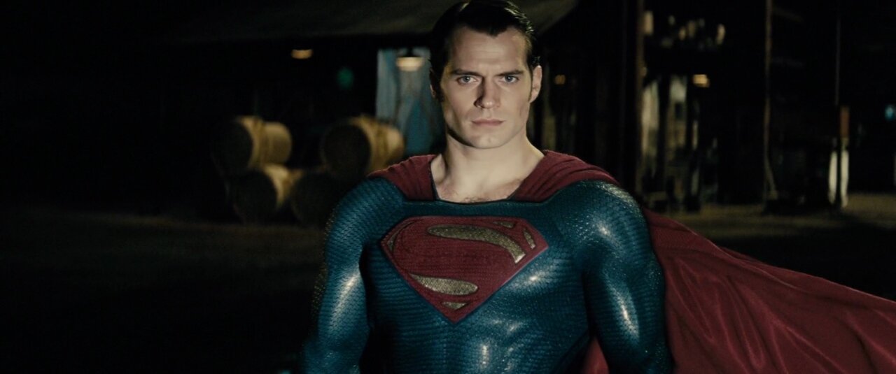
Batman vs Superman (2016)
American comics use the same colors with many costumes based around this striking combination, in print and on screen. In this case, although there are parallels between the woodblock styles and those of graphic novel and comic illustrations, the connotations with flags and patriotism also play a part. Still, the red and blue suits of Superman, Spiderman, Captain America, Wonder Woman and so many more reflect the simplistic woodblock printing process two centuries earlier.

Blade Runner (1982)
I must mention Blade Runner (1982), which depicted the future not as a shiny perfect world of clean skyscrapers, but a dark decaying world. The use of color is more subtle than in the superhero films and closer still to the handmade woodblock prints. I believe the creative use of those early Japanese primaries, blue, red and yellow are an essential ingredient of the movie’s distinctive iconic look, as well as the misty, pastel-hued washes of colour in its scenes.

Birdman (2014)
More recently, Birdman (2014) embraced a woodblock-style look. Ukiyo-E translates as “pictures of the floating world”, which is very appropriate for this film. I love its use of pastel blues and pinks, even as it plays on the idea of a more complicated world than that of typical comic book superheroes.
If you have a project ahead of you, consider looking outside your usual field of inspirations to different ways people have evocatively used color. Challenge yourself to consider using it for effect in a way that is contrary to what you are accustomed to.
Inspiration is everywhere - be inspired!
For more articles check out my archive and sign up to my newsletter.
For more inspiration take one of my courses.
[1] “The history of Ukiyo-E” exhibition at National Chiang Kai-shek Memorial Hall in Taipei, Taiwan, February 2020


